Here at MxToolbox, we’re big fans of good graphs and charts that provide insights, show trends and give you decision-making information. And, it always helps if they look good.
We’ve recently launched an update to all our charts and graphs for MxToolbox Professional users. Now, paid users get graphs that are much more interactive with much more information. In short, this:
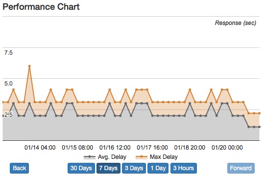
Becomes this:
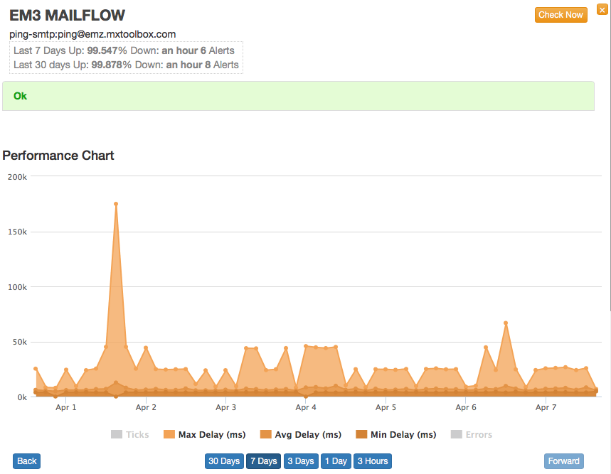
Each data set can be selected, deselected and the timeline adjusted right from the graph. And, we think the new graphics are beautiful, too…